/* ============================================================================
Medley marketing site: shared chrome + primitives (2026-08-16 rebuild,
Medley brand pass 2026-10-16 per LeagueLinkd/marketing/brand/medley/BRAND.md)
COLOR RULES (BRAND.md contrast table): dark blue #1f2430 is the button and
text color; coral #fc6d55 is for the mark, the tagline and accents only.
White on coral (2.8:1) and coral text on white (2.8:1) both FAIL, so coral
never carries text on a light surface and never sits behind white text.
Coral TEXT is allowed on dark blue (5.5:1). The Game Time band keeps its
green pitch accent (the in-app Game Time screens are dark-pitch green).
Static CSS, no build step. Loaded by index / families / leagues / game-time /
pricing. Page-specific layout stays inline on each page.
IMAGE CONTRACT (phone screenshots, intrinsic 1320x2580 = 22:43, status bar
and home indicator already cropped). Use this exact pattern everywhere:
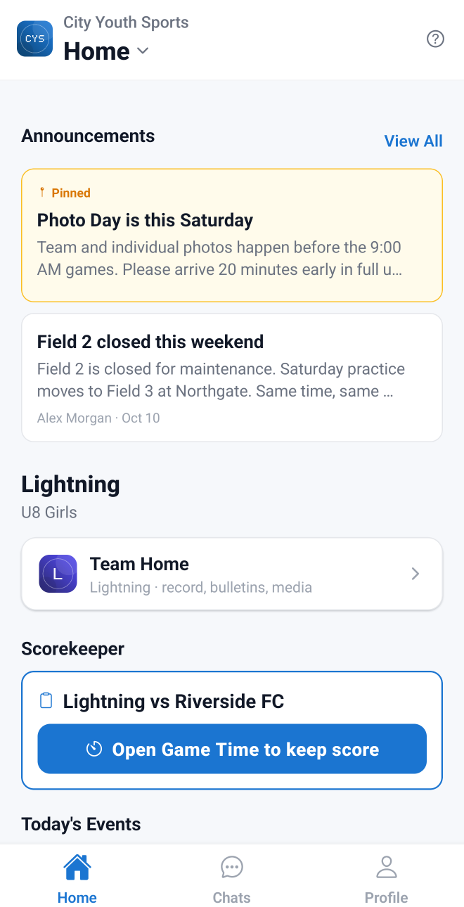 Hero-critical center phones use loading="eager" fetchpriority="high" plus
ONE in the
page head. Desktop console shots (2880x1800) use
with -800/-1200/-1600.webp + -1200.png.
============================================================================ */
*, *::before, *::after { box-sizing: border-box; margin: 0; padding: 0; }
:root {
--brand: #1f2430; /* Medley dark blue: buttons, text, dark surfaces */
--brand-hover: #363d4f;
--coral: #fc6d55; /* accents only; never text on light, never behind white text */
--coral-1: #fc6466; /* gradient start (mark / tile only) */
--coral-2: #fc7839; /* gradient end */
--tint: #FFF3EF; /* warm coral wash for light surfaces */
--tint-line: #FFDCD2;
--ink: #1f2430;
--ink-2: #181c26;
--green: #34D399;
--green-deep: #15803D;
--gray-50: #F9FAFB;
--gray-100: #F3F4F6;
--gray-200: #E5E7EB;
--gray-300: #D1D5DB;
--gray-400: #9CA3AF;
--gray-500: #6B7280;
--gray-700: #374151;
--gray-900: #111827;
--white: #ffffff;
--shadow-phone: 0 24px 60px rgba(17,24,39,0.22), 0 6px 16px rgba(17,24,39,0.12);
--shadow-card: 0 1px 2px rgba(17,24,39,.04), 0 10px 30px rgba(17,24,39,.06);
--wrap: 1160px;
--nav-h: 64px;
/* Display face for headings (Ben 10/16: Poppins); body copy stays Inter. */
--font-display: 'Poppins', 'Inter', -apple-system, BlinkMacSystemFont, 'Segoe UI', sans-serif;
}
html { scroll-behavior: smooth; -webkit-text-size-adjust: 100%; }
body {
font-family: 'Inter', -apple-system, BlinkMacSystemFont, 'Segoe UI', sans-serif;
color: var(--gray-900); background: var(--white); line-height: 1.6;
-webkit-font-smoothing: antialiased; overflow-x: hidden;
}
img, picture, svg { display: block; max-width: 100%; }
a { color: inherit; }
:focus-visible { outline: 3px solid var(--brand); outline-offset: 3px; border-radius: 6px; }
.on-dark :focus-visible, .band :focus-visible, .gametime :focus-visible, .site-footer :focus-visible { outline-color: #fff; }
/* Headlines never leave a one-word last line (card 7446a01a); body copy avoids orphans too. */
h1, h2, h3 { text-wrap: balance; }
h1, h2, h3, .h2 { font-family: var(--font-display); }
p, li { text-wrap: pretty; }
/* The coral accent on a headline phrase: dark text over ONE thin coral stroke
(coral text on white fails contrast, so the color sits under the words). */
.hl { font-style: normal; color: inherit; background: none; padding: 0; text-decoration-line: underline; text-decoration-color: var(--coral); text-decoration-thickness: .08em; text-underline-offset: .14em; text-decoration-skip-ink: auto; }
.nav :focus-visible { outline-color: var(--brand); }
.visually-hidden { position: absolute !important; width: 1px; height: 1px; overflow: hidden; clip: rect(0 0 0 0); white-space: nowrap; }
/* ── Layout helpers ─────────────────────────────────────────────────────── */
.wrap { max-width: var(--wrap); margin: 0 auto; padding: 0 24px; }
.wrap-narrow { max-width: 860px; margin: 0 auto; padding: 0 24px; }
.section { padding: 88px 0; }
.section-tight { padding: 56px 0; }
.section-alt { background: linear-gradient(180deg, #F7F8FA 0%, #FFFFFF 100%); }
.sec-head { max-width: 720px; margin: 0 auto 48px; text-align: center; }
.sec-head.left { margin-left: 0; text-align: left; }
.sec-head h2, .h2 { font-size: clamp(30px, 4.2vw, 46px); font-weight: 700; letter-spacing: -.02em; line-height: 1.1; }
.sec-head p, .lede { font-size: 17.5px; color: var(--gray-500); margin-top: 14px; }
.kicker {
display: inline-flex; align-items: center; gap: 8px; color: var(--brand);
font-size: 12.5px; font-weight: 800; letter-spacing: 1px; text-transform: uppercase; margin-bottom: 14px;
}
.kicker::before { content: ""; width: 18px; height: 3px; border-radius: 3px; background: var(--coral); }
.on-dark .kicker, .band .kicker { color: var(--coral); }
.on-dark .kicker::before, .band .kicker::before { background: var(--coral); }
.gametime .kicker, .gt .kicker { color: var(--green); }
.gametime .kicker::before, .gt .kicker::before { background: var(--green); }
.eyebrow {
display: inline-flex; align-items: center; gap: 8px; background: white; color: var(--brand);
font-size: 12.5px; font-weight: 700; letter-spacing: .3px; padding: 7px 14px; border-radius: 20px;
border: 1px solid var(--tint-line); margin-bottom: 20px;
}
.eyebrow .dot { width: 7px; height: 7px; border-radius: 50%; background: var(--coral); animation: pulse 2.2s ease-in-out infinite; }
@keyframes pulse { 0%,100%{opacity:1} 50%{opacity:.35} }
/* ── Buttons ────────────────────────────────────────────────────────────── */
.btn-primary, .btn-ghost, .btn-light, .btn-dark {
display: inline-flex; align-items: center; justify-content: center; gap: 8px;
font-size: 15px; font-weight: 700; padding: 15px 28px; border-radius: 12px; text-decoration: none;
transition: background .15s, transform .15s, border-color .15s, color .15s; white-space: nowrap;
}
.btn-primary { background: var(--brand); color: #fff; box-shadow: 0 1px 2px rgba(31,36,48,.12), 0 4px 12px rgba(31,36,48,.14); }
.btn-primary:hover { background: var(--brand-hover); transform: translateY(-1px); }
.btn-ghost { background: #fff; color: var(--gray-900); font-weight: 600; padding: 15px 24px; border: 1px solid var(--gray-200); }
.btn-ghost:hover { border-color: var(--brand); color: var(--brand); }
.btn-light { background: #fff; color: var(--ink); }
.btn-light:hover { background: var(--tint); transform: translateY(-1px); }
.btn-outline-light { display: inline-flex; align-items: center; justify-content: center; gap: 8px; font-size: 15px; font-weight: 700; padding: 14px 26px; border-radius: 12px; text-decoration: none; white-space: nowrap; color: #fff; border: 1px solid rgba(255,255,255,.32); transition: border-color .15s, background .15s; }
.btn-outline-light:hover { border-color: #fff; background: rgba(255,255,255,.06); }
.btn-dark { background: var(--ink); color: #fff; }
.btn-dark:hover { background: #1c2740; transform: translateY(-1px); }
.btn-sm { font-size: 14px; padding: 11px 18px; border-radius: 10px; }
.link-arrow { display: inline-flex; align-items: center; gap: 6px; color: var(--brand); font-weight: 700; text-decoration: none; font-size: 15px; }
.link-arrow::after { content: "\2192"; transition: transform .15s; }
.link-arrow::after { color: var(--coral); }
.link-arrow:hover { text-decoration: underline; text-underline-offset: 3px; }
.link-arrow:hover::after { transform: translateX(3px); }
.on-dark .link-arrow, .band .link-arrow, .on-dark .link-arrow::after, .band .link-arrow::after { color: var(--coral); }
.gametime .link-arrow, .gametime .link-arrow::after, .gt .link-arrow, .gt .link-arrow::after { color: var(--green); }
/* ── Tags ───────────────────────────────────────────────────────────────── */
/* The old "Pro" tier tag is retired (four flat plans, everything included).
.pro-tag survives as the green Game Time pill only. */
.pro-tag {
display: inline-flex; align-items: center; gap: 6px; font-size: 12px; font-weight: 800; letter-spacing: .5px;
color: var(--green); background: rgba(52,211,153,.12); border: 1px solid rgba(52,211,153,.3);
padding: 5px 12px; border-radius: 16px; text-transform: uppercase;
}
.pro-tag .pip, .gt-flag .pip { width: 7px; height: 7px; border-radius: 50%; background: var(--green); box-shadow: 0 0 0 4px rgba(52,211,153,.25); }
/* ── Sport row (the seven kit sport icons + the tagline) ─────────────────── */
.sport-row { display: flex; align-items: center; justify-content: center; gap: 10px 14px; flex-wrap: wrap; margin: 4px 0 6px; }
.sport-icons { display: flex; gap: 6px; }
.sport-icons img { width: 26px; height: 26px; }
.sport-row .tagline { font-size: 12.5px; font-weight: 700; letter-spacing: .22em; text-transform: uppercase; color: var(--gray-700); }
/* ── Nav ────────────────────────────────────────────────────────────────── */
.nav {
position: sticky; top: 0; z-index: 100;
background: rgba(255,255,255,0.97);
backdrop-filter: blur(10px); -webkit-backdrop-filter: blur(10px);
border-bottom: 1px solid var(--gray-200);
height: var(--nav-h);
}
.nav-inner { max-width: 1200px; margin: 0 auto; height: 100%; padding: 0 24px; display: flex; align-items: center; justify-content: space-between; position: relative; }
.nav-logo { display: flex; align-items: center; text-decoration: none; flex-shrink: 0; }
/* The kit's one-piece horizontal logo (tile + wordmark), never rebuilt from type. */
.nav-wordmark { height: 32px; width: auto; display: block; }
.nav-links { display: flex; gap: 6px; align-items: center; }
.nav-link { font-size: 14px; font-weight: 600; color: var(--gray-700); text-decoration: none; padding: 9px 13px; border-radius: 9px; white-space: nowrap; transition: background .15s, color .15s; }
.nav-link:hover { color: var(--brand); background: var(--tint); }
.nav-link[aria-current="page"] { color: var(--brand); }
/* Nav buttons are OUTLINE so the solid buttons in the page (the hero doors) carry the weight. */
.nav-btn { font-size: 14px; font-weight: 700; color: var(--brand); background: #fff; box-shadow: inset 0 0 0 1.5px var(--brand); text-decoration: none; padding: 9px 18px; border-radius: 9px; white-space: nowrap; transition: background .15s, color .15s; margin-left: 6px; }
.nav-btn:hover { background: var(--brand); color: #fff; }
/* Phone-only "Get the app" beside the burger (card 7446a01a: at 390px the old
header button ran off screen). Hidden on desktop, where .nav-btn shows. */
.nav-cta { display: none; margin-left: auto; margin-right: 6px; font-size: 14px; font-weight: 700; color: var(--brand); background: #fff; box-shadow: inset 0 0 0 1.5px var(--brand); text-decoration: none; padding: 9px 14px; border-radius: 9px; white-space: nowrap; transition: background .15s, color .15s; }
.nav-cta:hover { background: var(--brand); color: #fff; }
.nav-toggle { position: absolute; opacity: 0; width: 1px; height: 1px; pointer-events: none; }
.nav-burger { display: none; width: 42px; height: 42px; border-radius: 10px; cursor: pointer; align-items: center; justify-content: center; flex-direction: column; gap: 5px; }
.nav-burger span { display: block; width: 20px; height: 2px; background: var(--gray-900); border-radius: 2px; transition: transform .2s, opacity .2s; }
.nav-toggle:focus-visible + .nav-burger { outline: 3px solid var(--brand); outline-offset: 2px; }
@media (max-width: 900px) {
.nav-burger { display: flex; flex-shrink: 0; }
.nav-cta { display: inline-flex; }
.nav-links .nav-btn { display: none; }
.nav-inner { padding: 0 16px; }
.nav-links {
display: none; position: absolute; top: var(--nav-h); left: 0; right: 0;
flex-direction: column; align-items: stretch; gap: 2px; padding: 10px 16px 16px;
background: #fff; border-bottom: 1px solid var(--gray-200); box-shadow: 0 20px 40px rgba(17,24,39,.08);
}
.nav-toggle:checked ~ .nav-links { display: flex; }
.nav-toggle:checked + .nav-burger span:nth-child(1) { transform: translateY(7px) rotate(45deg); }
.nav-toggle:checked + .nav-burger span:nth-child(2) { opacity: 0; }
.nav-toggle:checked + .nav-burger span:nth-child(3) { transform: translateY(-7px) rotate(-45deg); }
.nav-link { font-size: 16px; padding: 12px 12px; }
.nav-btn { margin: 8px 0 0; text-align: center; padding: 13px 18px; font-size: 15px; border-radius: 11px; }
}
@media (max-width: 360px) {
.nav-wordmark { height: 26px; }
.nav-cta { padding: 8px 11px; font-size: 13.5px; }
}
/* ── Footer ─────────────────────────────────────────────────────────────── */
.site-footer { background: var(--ink); color: var(--gray-400); padding: 64px 0 32px; font-size: 14px; }
.footer-grid { display: grid; grid-template-columns: 1.6fr 1fr 1fr 1fr; gap: 32px; }
.footer-logo { height: 30px; width: auto; display: block; margin-bottom: 16px; }
.footer-brand p { color: var(--gray-400); max-width: 300px; }
.footer-brand p.footer-tagline { color: var(--coral); font-size: 12px; font-weight: 700; letter-spacing: .22em; text-transform: uppercase; margin-bottom: 6px; }
.site-footer h4 { color: #fff; font-size: 12.5px; font-weight: 800; letter-spacing: 1px; text-transform: uppercase; margin-bottom: 14px; }
.site-footer nav a { display: block; color: var(--gray-400); text-decoration: none; padding: 5px 0; transition: color .15s; }
.site-footer nav a:hover { color: #fff; }
.footer-copy { max-width: none; margin: 44px max(24px, calc((100% - var(--wrap)) / 2 + 24px)) 0; padding: 22px 0 0; border-top: 1px solid rgba(255,255,255,.08); color: #8b93a3; font-size: 13px; display: flex; flex-wrap: wrap; gap: 8px 24px; justify-content: space-between; }
@media (max-width: 760px) {
.footer-grid { grid-template-columns: 1fr 1fr; }
.footer-brand { grid-column: 1 / -1; }
}
/* ── Dark band ──────────────────────────────────────────────────────────── */
.band { background: var(--ink); color: #fff; padding: 88px 0; }
.band.compact { padding: 32px 0; }
.band h2, .band h3 { color: #fff; }
.band p { color: #C7D0DC; }
.band-inner { max-width: 1100px; margin: 0 auto; padding: 0 24px; display: flex; align-items: center; justify-content: space-between; gap: 20px; flex-wrap: wrap; }
.band-inner h3 { font-size: 21px; font-weight: 600; letter-spacing: -.02em; }
.band-inner p { font-size: 14.5px; color: #9CA3AF; margin-top: 2px; }
.band-btn { display: inline-flex; align-items: center; gap: 8px; background: #fff; color: var(--ink); font-size: 14.5px; font-weight: 700; padding: 13px 24px; border-radius: 11px; text-decoration: none; transition: background .15s; white-space: nowrap; }
.band-btn:hover { background: var(--tint); }
.gametime {
background: radial-gradient(900px 500px at 80% 0%, rgba(21,128,61,.30) 0%, rgba(21,128,61,0) 60%), var(--ink);
color: #fff; overflow: hidden;
}
.gt-eyebrow { display: inline-flex; align-items: center; gap: 8px; color: var(--green); font-size: 13px; font-weight: 800; letter-spacing: 1px; text-transform: uppercase; margin-bottom: 14px; }
.gt-tag { display: inline-block; margin-top: 26px; font-size: 13px; font-weight: 700; color: var(--green); background: rgba(52,211,153,.12); border: 1px solid rgba(52,211,153,.3); padding: 7px 14px; border-radius: 18px; }
@media (max-width: 760px) {
.band-inner { flex-direction: column; text-align: center; }
}
/* ── Phone frame (22:43) ─────────────────────────────────────────────────── */
.phone {
--w: 220px;
width: var(--w); aspect-ratio: 22 / 43; flex-shrink: 0;
border: 3px solid var(--ink); border-radius: calc(var(--w) * .127); overflow: hidden;
background: #fff; box-shadow: var(--shadow-phone); margin: 0;
}
.phone picture, .phone img { width: 100%; height: 100%; }
.phone img { object-fit: cover; object-position: top; }
.phone.on-dark, .on-dark .phone, .band .phone { border-color: #060A12; box-shadow: 0 36px 80px rgba(0,0,0,.5); }
/* ── Browser frame (desktop console shots, 2880x1800) ───────────────────── */
.browser {
position: relative; width: 100%; margin: 0; border-radius: 14px; overflow: hidden; background: #fff;
border: 1px solid var(--gray-200); box-shadow: 0 30px 70px rgba(17,24,39,.16), 0 4px 12px rgba(17,24,39,.06);
}
.browser::before {
content: ""; display: block; height: 36px; border-bottom: 1px solid var(--gray-200);
background-image: radial-gradient(circle at 16px 18px, #FF5F57 5px, transparent 5.5px),
radial-gradient(circle at 32px 18px, #FEBC2E 5px, transparent 5.5px),
radial-gradient(circle at 48px 18px, #28C840 5px, transparent 5.5px),
linear-gradient(180deg, #F3F4F6, #E9EBEF);
}
.browser::after {
content: "app.leaguelinkd.com"; position: absolute; top: 7px; left: 50%; transform: translateX(-50%);
height: 22px; padding: 0 14px; border-radius: 11px; background: #fff; border: 1px solid var(--gray-200);
color: var(--gray-500); font-size: 11px; font-weight: 600; letter-spacing: .1px; line-height: 20px; white-space: nowrap;
}
.browser picture, .browser img { width: 100%; height: auto; aspect-ratio: 2880 / 1800; object-fit: cover; object-position: top; }
.on-dark .browser, .band .browser { border-color: rgba(255,255,255,.08); box-shadow: 0 30px 70px rgba(0,0,0,.5); }
/* ── Feature rows ───────────────────────────────────────────────────────── */
.feat { display: grid; grid-template-columns: 1fr 1fr; gap: 56px; align-items: center; padding: 56px 0; }
.feat + .feat { border-top: 1px solid var(--gray-100); }
/* The section supplies the outer padding; the first and last rows add none of their own. */
.feat:first-child { padding-top: 0; }
.feat:last-child { padding-bottom: 0; }
.feat.flip .feat-text { order: 2; }
.feat.flip .feat-media { order: 1; }
.feat-text h3, .feat-text h2 { font-size: clamp(26px, 3.2vw, 36px); font-weight: 700; letter-spacing: -.02em; line-height: 1.15; margin-bottom: 14px; }
.feat-text > p { font-size: 17px; color: var(--gray-500); margin-bottom: 20px; max-width: 480px; }
.band .feat-text > p, .on-dark .feat-text > p { color: #C7D0DC; }
.feat-text .link-arrow { margin-top: 18px; }
.feat-media { display: flex; justify-content: center; align-items: flex-end; min-width: 0; }
/* Widths for phones inside a pair/trio come from these rules (not inline --w),
so the mobile breakpoints below can shrink them. */
.phone-pair { display: flex; align-items: flex-end; justify-content: center; gap: 0; }
.phone-pair .phone { --w: 210px; }
.phone-pair .phone:first-child { transform: rotate(-4deg) translateY(10px); margin-right: -26px; z-index: 1; }
.phone-pair .phone:last-child { transform: rotate(3deg); z-index: 2; }
.phone-trio { display: flex; align-items: flex-end; justify-content: center; }
.phone-trio .phone { --w: 176px; }
.phone-trio .phone:nth-child(1) { transform: rotate(-6deg) translateY(22px); margin-right: -34px; z-index: 1; }
.phone-trio .phone:nth-child(2) { --w: 196px; z-index: 3; }
.phone-trio .phone:nth-child(3) { transform: rotate(6deg) translateY(22px); margin-left: -34px; z-index: 2; }
.phone-browser { display: flex; align-items: flex-end; justify-content: center; position: relative; width: 100%; }
.phone-browser .browser { flex: 1 1 auto; max-width: 560px; }
.phone-browser .phone { margin-left: -70px; margin-bottom: -18px; z-index: 2; }
@media (max-width: 900px) {
.feat { grid-template-columns: 1fr; gap: 34px; padding: 44px 0; }
.feat.flip .feat-text, .feat.flip .feat-media { order: initial; }
.feat-media { order: -1; }
.feat.flip .feat-media { order: -1; }
.feat-text > p { max-width: none; }
.phone-pair .phone { --w: 160px; }
.phone-trio .phone { --w: 140px; }
.phone-trio .phone:nth-child(2) { --w: 156px; }
.phone-trio .phone:nth-child(1) { margin-right: -24px; }
.phone-trio .phone:nth-child(3) { margin-left: -24px; }
.phone-browser { flex-direction: column; align-items: center; gap: 18px; }
.phone-browser .phone { margin: 0; --w: 160px; }
.phone-browser .browser { max-width: 100%; }
}
@media (max-width: 480px) {
.phone-pair .phone { --w: 150px; }
.phone-trio .phone { --w: 118px; }
.phone-trio .phone:nth-child(2) { --w: 134px; }
}
/* At 320 the 118/134/118 trio ran 10px past the screen (horizontal scroll). */
@media (max-width: 360px) {
.phone-trio .phone { --w: 96px; }
.phone-trio .phone:nth-child(2) { --w: 112px; }
.phone-trio .phone:nth-child(1) { margin-right: -18px; }
.phone-trio .phone:nth-child(3) { margin-left: -18px; }
}
/* ── Check lists ────────────────────────────────────────────────────────── */
.check-list { list-style: none; display: flex; flex-direction: column; gap: 12px; }
/* The marker is absolutely positioned rather than a flex item: as a flex
container the li turned every child into its own flex item, so `Presets`
and the ": League Game, ..." text that follows it were split by the 12px gap
("Presets : League Game", "timers , color-coded"). Keeping the li a normal
block lets the bold lead-in and its sentence flow as one line of text. */
.check-list li { position: relative; padding-left: 32px; font-size: 15.5px; color: var(--gray-700); line-height: 1.5; }
.check-list li::before {
content: ""; position: absolute; left: 0; top: 2px; width: 20px; height: 20px; border-radius: 50%;
background: var(--tint) url("data:image/svg+xml,%3Csvg xmlns='http://www.w3.org/2000/svg' viewBox='0 0 24 24' fill='none' stroke='%231f2430' stroke-width='3' stroke-linecap='round' stroke-linejoin='round'%3E%3Cpolyline points='20 6 9 17 4 12'/%3E%3C/svg%3E") center / 11px no-repeat;
}
.check-list li b { color: var(--gray-900); font-weight: 700; }
.check-list.on-dark li, .band .check-list li, .gametime .check-list li { color: #E5E9F0; }
.check-list.on-dark li b, .band .check-list li b, .gametime .check-list li b { color: #fff; }
.check-list.on-dark li::before, .band .check-list li::before {
background-color: rgba(252,109,85,.16);
background-image: url("data:image/svg+xml,%3Csvg xmlns='http://www.w3.org/2000/svg' viewBox='0 0 24 24' fill='none' stroke='%23fc6d55' stroke-width='3' stroke-linecap='round' stroke-linejoin='round'%3E%3Cpolyline points='20 6 9 17 4 12'/%3E%3C/svg%3E");
}
.gametime .check-list li::before, .gt .check-list li::before {
background-color: rgba(52,211,153,.14);
background-image: url("data:image/svg+xml,%3Csvg xmlns='http://www.w3.org/2000/svg' viewBox='0 0 24 24' fill='none' stroke='%2334D399' stroke-width='3' stroke-linecap='round' stroke-linejoin='round'%3E%3Cpolyline points='20 6 9 17 4 12'/%3E%3C/svg%3E");
}
.check-list.two-col { display: grid; grid-template-columns: 1fr 1fr; gap: 12px 28px; }
@media (max-width: 640px) { .check-list.two-col { grid-template-columns: 1fr; } }
/* ── Screen grid + rail ─────────────────────────────────────────────────── */
/* Explicit column counts, not auto-fit: at ~1140px auto-fit resolves to five
columns, which strands the sixth tile alone on a second row. Three columns
gives a balanced 3x2 for the six-tile grid and stays even for three. */
.screen-grid { display: grid; grid-template-columns: repeat(3, minmax(0, 1fr)); gap: 34px 22px; justify-items: center; }
.screen-grid figure.phone { --w: 180px; }
.screen-item { display: flex; flex-direction: column; align-items: center; text-align: center; gap: 14px; max-width: 220px; }
.screen-item .cap { font-size: 14px; color: var(--gray-700); line-height: 1.45; }
.screen-item .cap b { display: block; color: var(--gray-900); font-weight: 800; margin-bottom: 2px; }
.on-dark .screen-item .cap, .band .screen-item .cap { color: #C7D0DC; }
.on-dark .screen-item .cap b, .band .screen-item .cap b { color: #fff; }
.screen-rail { display: flex; gap: 22px; align-items: flex-start; justify-content: center; }
.screen-rail .screen-item { flex: 0 0 auto; }
@media (max-width: 900px) {
.screen-rail {
justify-content: flex-start; overflow-x: auto; scroll-snap-type: x mandatory;
padding: 4px 24px 18px; margin: 0 calc(-1 * min(24px, (100vw - 100%) / 2)); scrollbar-width: none; -webkit-overflow-scrolling: touch;
}
.screen-rail::-webkit-scrollbar { display: none; }
.screen-rail .screen-item { scroll-snap-align: center; }
.screen-grid { grid-template-columns: repeat(2, minmax(0, 1fr)); gap: 26px 14px; }
.screen-grid figure.phone { --w: 150px; }
}
/* ── Hero arc (5-phone fan, home page) ──────────────────────────────────── */
/* Phones anchor to the arc bottom and only ever translate DOWNWARD, so nothing
extends up over the headline. Heights follow the 22:43 aspect of --w:
184 -> 360, 200 -> 391, 220 -> 430. */
.arc { position: relative; width: 100%; max-width: 1180px; height: 440px; margin: 30px auto 0; flex-shrink: 0; }
.arc .ph { position: absolute; left: 50%; bottom: 0; transform-origin: bottom center; }
.ph-l2 { --w: 184px; transform: translateX(-424px) translateY(82px) rotate(-16deg); z-index: 1; }
.ph-l1 { --w: 200px; transform: translateX(-272px) translateY(40px) rotate(-8deg); z-index: 2; }
.ph-c { --w: 220px; transform: translateX(-110px) translateY(2px) rotate(0deg); z-index: 5; box-shadow: 0 30px 70px rgba(11,18,32,.34); }
.ph-r1 { --w: 200px; transform: translateX(72px) translateY(40px) rotate(8deg); z-index: 2; }
.ph-r2 { --w: 184px; transform: translateX(240px) translateY(82px) rotate(16deg); z-index: 1; }
.gt-flag {
position: absolute; z-index: 9; left: 50%; bottom: 414px; transform: translateX(-50%);
display: inline-flex; align-items: center; gap: 7px; background: var(--ink); color: #fff;
font-size: 12px; font-weight: 800; letter-spacing: .4px; padding: 8px 15px; border-radius: 20px; white-space: nowrap;
box-shadow: 0 10px 24px rgba(11,18,32,.3);
}
@media (max-width: 1040px) { .arc { transform: scale(.8); transform-origin: top center; height: 360px; } }
@media (max-width: 760px) {
.arc { transform: none; height: 412px; margin: 24px auto 0; }
.arc .ph-l2, .arc .ph-r2, .gt-flag { display: none; }
.ph-c { --w: 208px; transform: translateX(-104px) translateY(0) rotate(0deg); box-shadow: 0 22px 48px rgba(11,18,32,.26); }
.ph-l1 { --w: 178px; transform: translateX(-239px) translateY(34px) rotate(-9deg); z-index: 3; }
.ph-r1 { --w: 178px; transform: translateX(61px) translateY(34px) rotate(9deg); z-index: 3; }
}
@media (max-width: 420px) {
.arc { height: 372px; }
.ph-c { --w: 188px; transform: translateX(-94px) translateY(0) rotate(0deg); }
.ph-l1 { --w: 160px; transform: translateX(-214px) translateY(30px) rotate(-9deg); }
.ph-r1 { --w: 160px; transform: translateX(54px) translateY(30px) rotate(9deg); }
}
/* ── 3-phone fan (sub-page heroes) ──────────────────────────────────────── */
.fan { position: relative; width: 100%; height: 436px; margin: 0 auto; }
.fan .phone { position: absolute; left: 50%; bottom: 0; transform-origin: bottom center; }
.fan-c { --w: 220px; transform: translateX(-110px); z-index: 3; box-shadow: 0 30px 70px rgba(11,18,32,.34); }
.fan-l { --w: 184px; transform: translateX(-282px) translateY(46px) rotate(-9deg); z-index: 1; }
.fan-r { --w: 184px; transform: translateX(98px) translateY(46px) rotate(9deg); z-index: 2; }
@media (max-width: 760px) {
.fan { height: 376px; }
.fan-c { --w: 190px; transform: translateX(-95px); }
.fan-l { --w: 156px; transform: translateX(-226px) translateY(36px) rotate(-9deg); }
.fan-r { --w: 156px; transform: translateX(70px) translateY(36px) rotate(9deg); }
}
@media (max-width: 420px) {
.fan { height: 340px; }
.fan-c { --w: 172px; transform: translateX(-86px); }
.fan-l { --w: 140px; transform: translateX(-200px) translateY(32px) rotate(-9deg); }
.fan-r { --w: 140px; transform: translateX(60px) translateY(32px) rotate(9deg); }
}
/* ── Sub-page hero ──────────────────────────────────────────────────────── */
.page-hero {
position: relative; overflow: hidden; text-align: center; padding: 64px 24px 0;
background:
radial-gradient(900px 440px at 50% -6%, var(--tint) 0%, rgba(255,243,239,0) 65%),
linear-gradient(180deg, #ffffff 0%, #FFF9F7 100%);
}
.page-hero h1 { font-size: clamp(36px, 5.6vw, 60px); font-weight: 700; line-height: 1.08; letter-spacing: -.02em; max-width: 900px; margin: 0 auto 16px; }
.page-hero h1 em { font-style: normal; color: inherit; background: none; padding: 0; text-decoration-line: underline; text-decoration-color: var(--coral); text-decoration-thickness: .08em; text-underline-offset: .14em; text-decoration-skip-ink: auto; }
.page-hero .hero-sub { font-size: 18px; color: var(--gray-500); max-width: 560px; margin: 0 auto 24px; }
.hero-ctas { display: flex; gap: 12px; flex-wrap: wrap; align-items: center; justify-content: center; margin-bottom: 18px; }
@media (max-width: 480px) { .hero-ctas { flex-direction: column; align-items: stretch; width: 100%; max-width: 340px; margin-left: auto; margin-right: auto; } }
.page-hero .fan { margin-top: 26px; }
.page-hero.on-dark { background: radial-gradient(900px 500px at 50% -10%, rgba(21,128,61,.34) 0%, rgba(21,128,61,0) 62%), var(--ink); color: #fff; }
.page-hero.on-dark .hero-sub { color: #C7D0DC; }
.page-hero.on-dark h1 em { color: var(--green); text-decoration: none; }
/* ── Steps ──────────────────────────────────────────────────────────────── */
.steps { list-style: none; counter-reset: step; display: flex; flex-direction: column; gap: 18px; }
.steps li { display: flex; gap: 16px; align-items: flex-start; counter-increment: step; }
.steps li::before {
content: counter(step); flex-shrink: 0; width: 34px; height: 34px; border-radius: 10px;
display: flex; align-items: center; justify-content: center; font-weight: 800; font-size: 14px;
background: var(--tint); color: var(--brand); border: 1px solid var(--tint-line);
}
.steps li b { display: block; font-size: 16px; font-weight: 800; line-height: 1.35; color: var(--gray-900); margin-bottom: 2px; }
.steps li p { font-size: 14.5px; color: var(--gray-500); }
.on-dark .steps li::before, .band .steps li::before { background: rgba(255,255,255,.08); color: #fff; border-color: rgba(255,255,255,.12); }
.on-dark .steps li b, .band .steps li b { color: #fff; }
.on-dark .steps li p, .band .steps li p { color: #C7D0DC; }
/* ── Cards / chips ──────────────────────────────────────────────────────── */
.card { background: #fff; border: 1px solid var(--gray-200); border-radius: 18px; padding: 26px 24px; box-shadow: var(--shadow-card); }
.chips { display: flex; flex-wrap: wrap; gap: 10px; justify-content: center; }
.chip { display: inline-flex; align-items: center; gap: 8px; font-size: 14px; font-weight: 600; color: var(--gray-700); background: #fff; border: 1px solid var(--gray-200); padding: 10px 16px; border-radius: 999px; }
.chip::before { content: ""; width: 8px; height: 8px; border-radius: 50%; background: var(--coral); }
/* ── Store badges ───────────────────────────────────────────────────────── */
.store-badges { display: flex; gap: 14px; justify-content: center; align-items: center; flex-wrap: wrap; }
.store-badge-img img { height: 52px; width: auto; display: block; }
.store-badge-img.play img { height: 52px; }
/* ── Phone rhythm ───────────────────────────────────────────────────────── */
@media (max-width: 720px) {
.section, .band { padding: 64px 0; }
.section-tight { padding: 44px 0; }
}
/* ── Motion ─────────────────────────────────────────────────────────────── */
@media (prefers-reduced-motion: reduce) {
html { scroll-behavior: auto; }
*, *::before, *::after { animation-duration: .01ms !important; animation-iteration-count: 1 !important; transition-duration: .01ms !important; }
}
